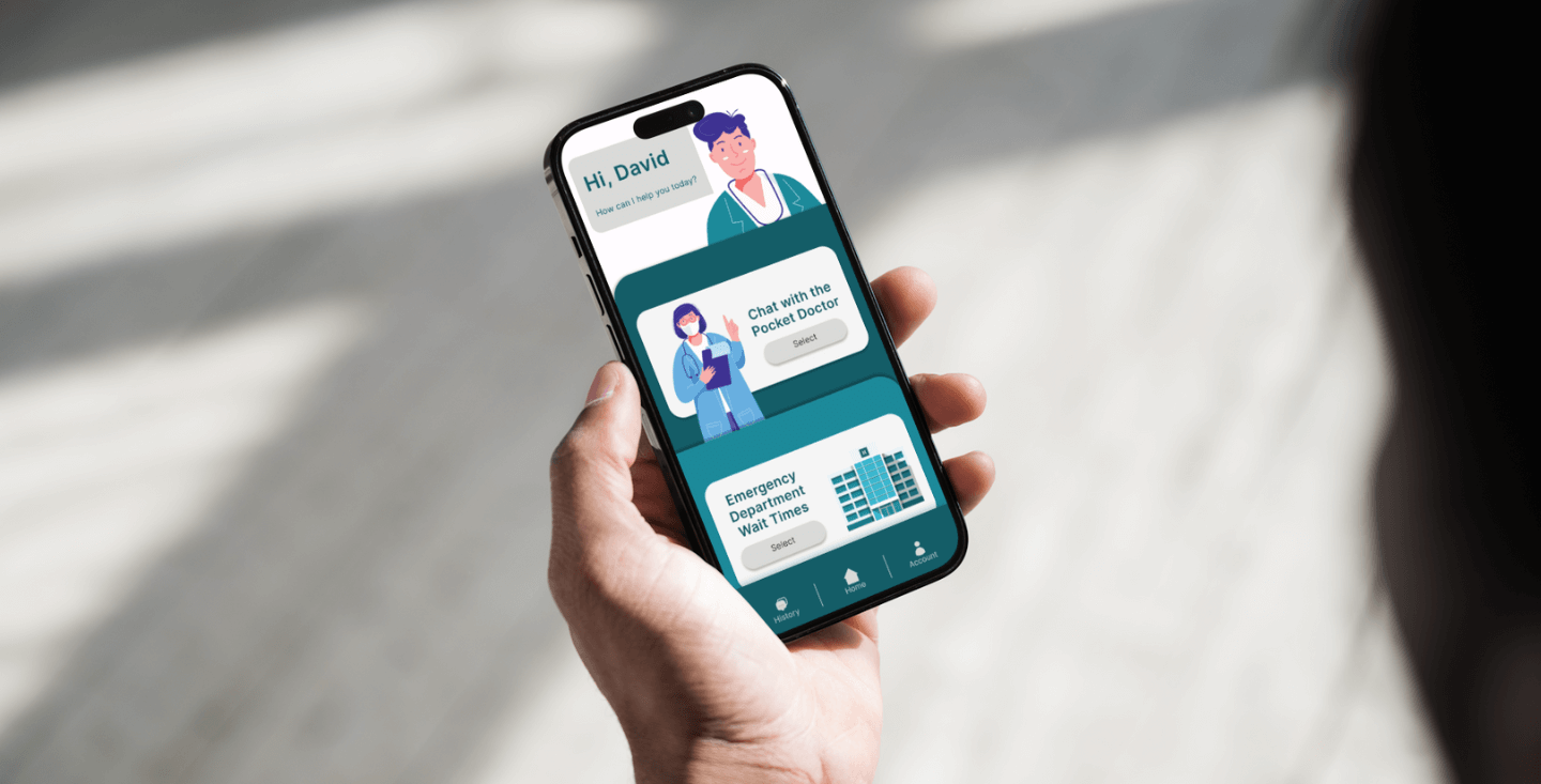
pocket doctor: A virtual ai doctor
An app to assist people with non-urgent medical conditions
Goal: Achieve a usability score of 90% or more.
This was a UX/UI project that required planning and designing a prototype for either a website or an app serving a specific target audience. I chose to create an app tailored for users without primary doctors who need information on non-medical conditions. The idea struck me when I spent over 4hours in the ER only to receive a band-aid. It would have been beneficial to receive such simple information without the prolonged wait.

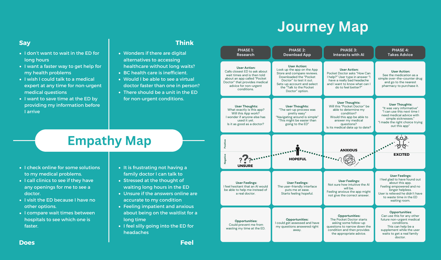
empathy & journey maps

I researched the ER wait times in British Columbia and identified common causes for delays. A significant number of BC residents lack a primary doctor, leading them to visit the ER for various medical issues, whether urgent or not. This contributes to longer wait times and additional workload for hospital staff. While online and telehealth services exist, their effectiveness relies on the availability of doctors and nurses. To address this, I considered implementing AI technology, similar to ChatGPT, allowing users to ask on-urgent medical questions, reducing the need for lengthy waits and easing ER overcrowding without the need to wait for medical staff availability. I considered AI, because it is more readily available than doctors, and it is constantly advancing to handle complex questions. So my target audience would be for those that do not have a primary doctor and need answers for non-urgent medical conditions.
Wireframes

Based on empathy and journey maps, I crafted a wireframe tailored to my audience, prioritizing primary interactions and maintaining simplicity to prevent user frustration. I aimed for intuitive design, employing familiar layouts to ease navigation. Given that my target users are already unwell, minimizing frustrations is important.
The chatbox interface was not too difficult to design as it is one of the most common interfaces that users are used to. But the area I needed more information on was AI and how it could be used in healthcare. I explored other hospitals and read some academic journals to understand the use of AI technology in enhancing patient care or staff performance. There are some hospitals and ER departments that are already utilizing AI, although not in the manner I am thinking about. Nevertheless, their objective is similar to alleviate overcrowding and simplify the responsibilities of medical staff.
Prototype

I really enjoyed this project phase, where I could flex my creative and problem-solving muscles. Opting for an art direction aimed at fostering friendliness, I chose illustrations and a soothing color palette over vibrant hues and real human images. To enhance usability, I incorporated visual cues and feedback where necessary; for instance, illuminating the send icon in the chatbox after user input to signal readiness to send a message.Experimenting with different ways of inputting responses, feedbacks and animations into the app was extremely fun.
Final Thoughts
The test results suggest a positive outcome as most users expressed
their satisfaction with the app, describing it as an effective tool
for the target audience. The app received an average rating of
4.9/5, with with a usability score of 84%.
Although I did not reach my goal, I discovered the importance of word
choices in the app's interface as this was a key high light during the
test. For instance, users struggling to locate the "Chat "button on the
history page. Although I did not have a chance to test it with my target
audience, the user testing still produced very useful information that
helped me to make modifications and other considerations to improve my
app. Such as better feedback and providing clearer labeling. The next
steps to this project would be the implementation of an AI, more user
testing to see what other components the users might require and the
accuracy of the answers.