People's Stories: An Interactive Website
Stories connected to people and various objects they left behind
Goal: Code a website with various plugins.
I created an interactive webpage that shares different stories of people through the items they've left behind in public places. This project shows my skills as a storyteller and a UI designer. Even though the project mainly asked for JavaScript plugins, I will be exploring more on how I used certain UI elements and principals to make each plugin work and for the website to feel user-friendly.
First Interaction
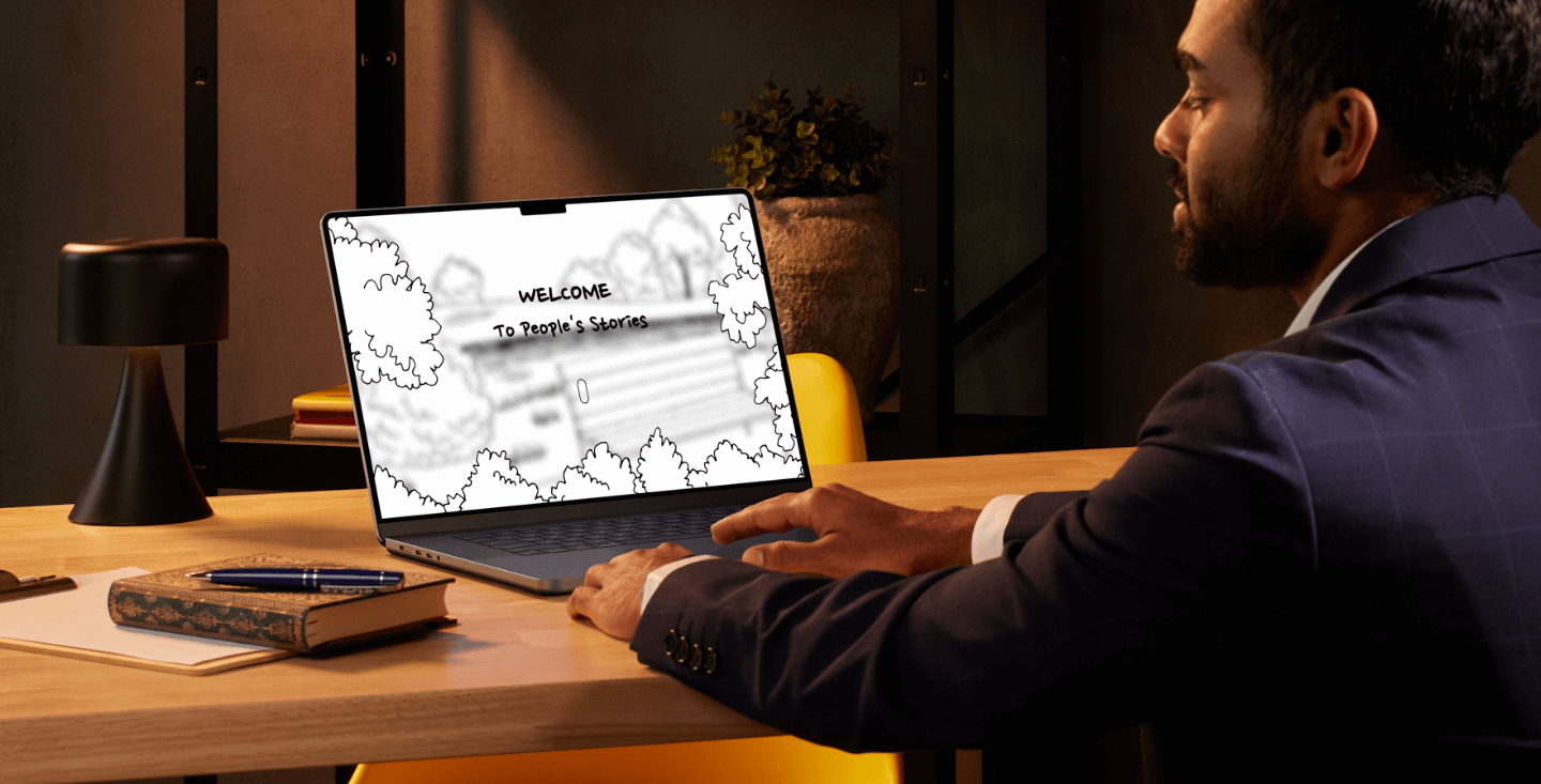
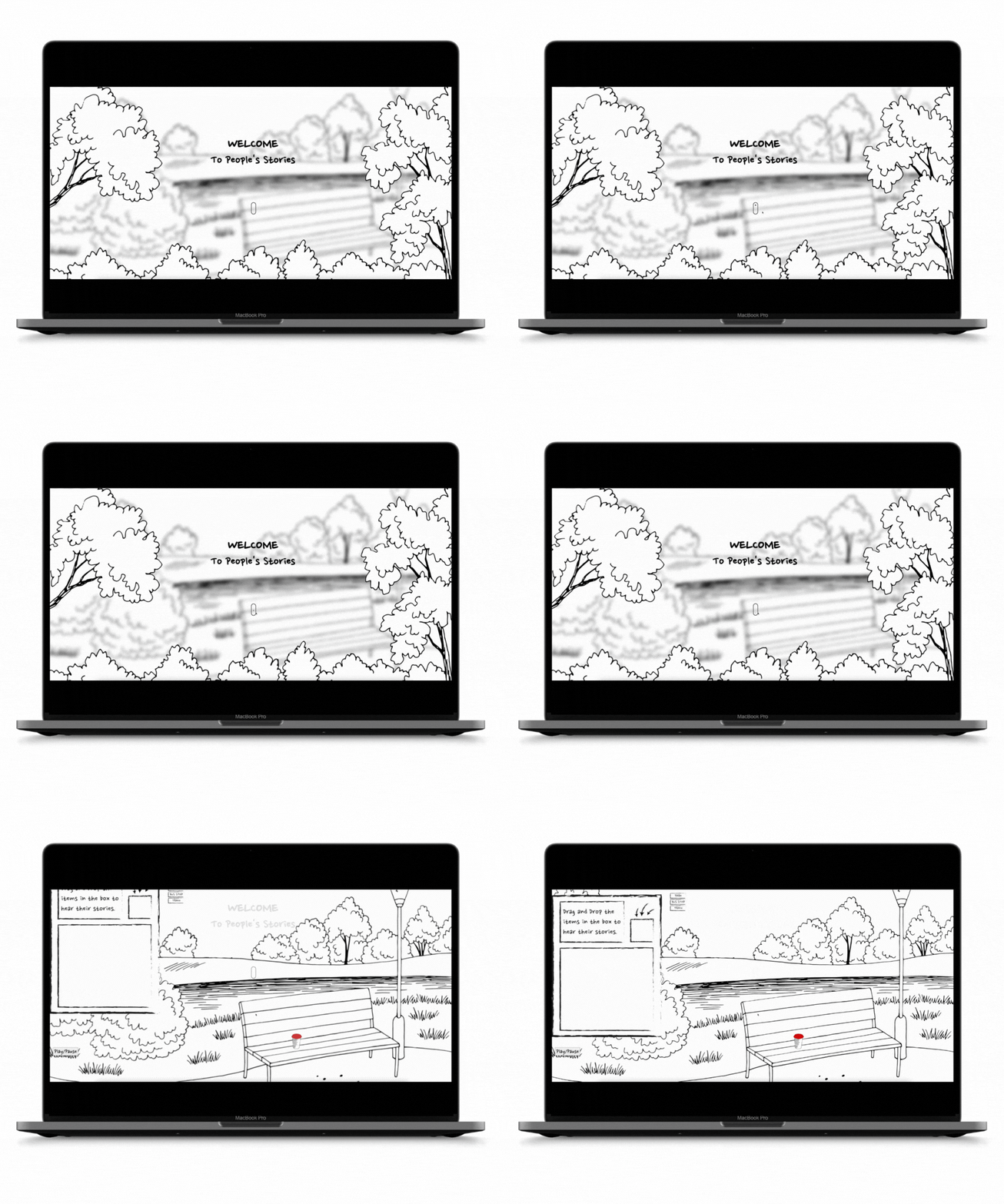
For the first plugin, I wanted to start the website's interaction with a scroll trigger. Instead of using it to make something appear as the page scrolls down, I used it as an entering mechanism to the website.I planned for the scrolling to make users feel like they're entering the webpage, with a gentle animation where trees and bushes at the front slowly vanish. This adds whimsy to the use of the scroll trigger. Once the user is on the page, the rest of the UI appears.
Scroll Icon
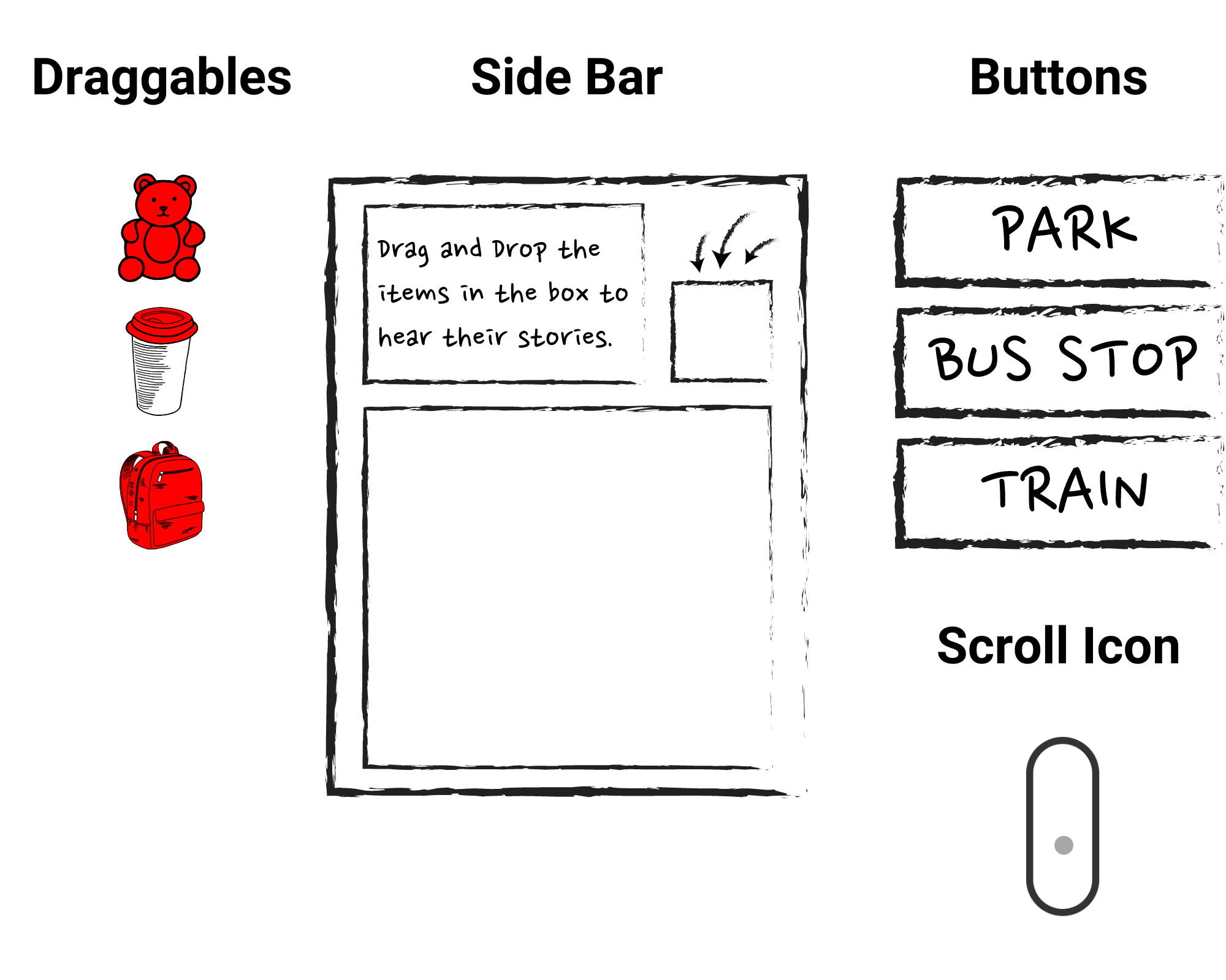
To make sure the users understand they needed to use the mouse scroll, I added a scroll icon animation. Without this, users would be carelessly clicking at random areas on the page. It is a subtle but an effective indicator.
Second Interaction
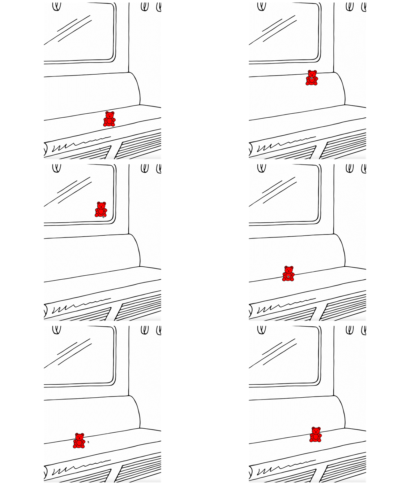
The second plugin was to make something draggable across the screen and place it anywhere. I used it to allow the user to pick up specific items that I want them to interact with on the page. To do this, I didn't want to just add a glow effect or even an arrow pointing at the item. I wanted to make it subtle and naturally fit the environment while still being noticable to the user. Thats why all I did was add the color red to the item. They are the only objects on the page with this distinctive color and they still feel natural to the environment.
Third Interaction
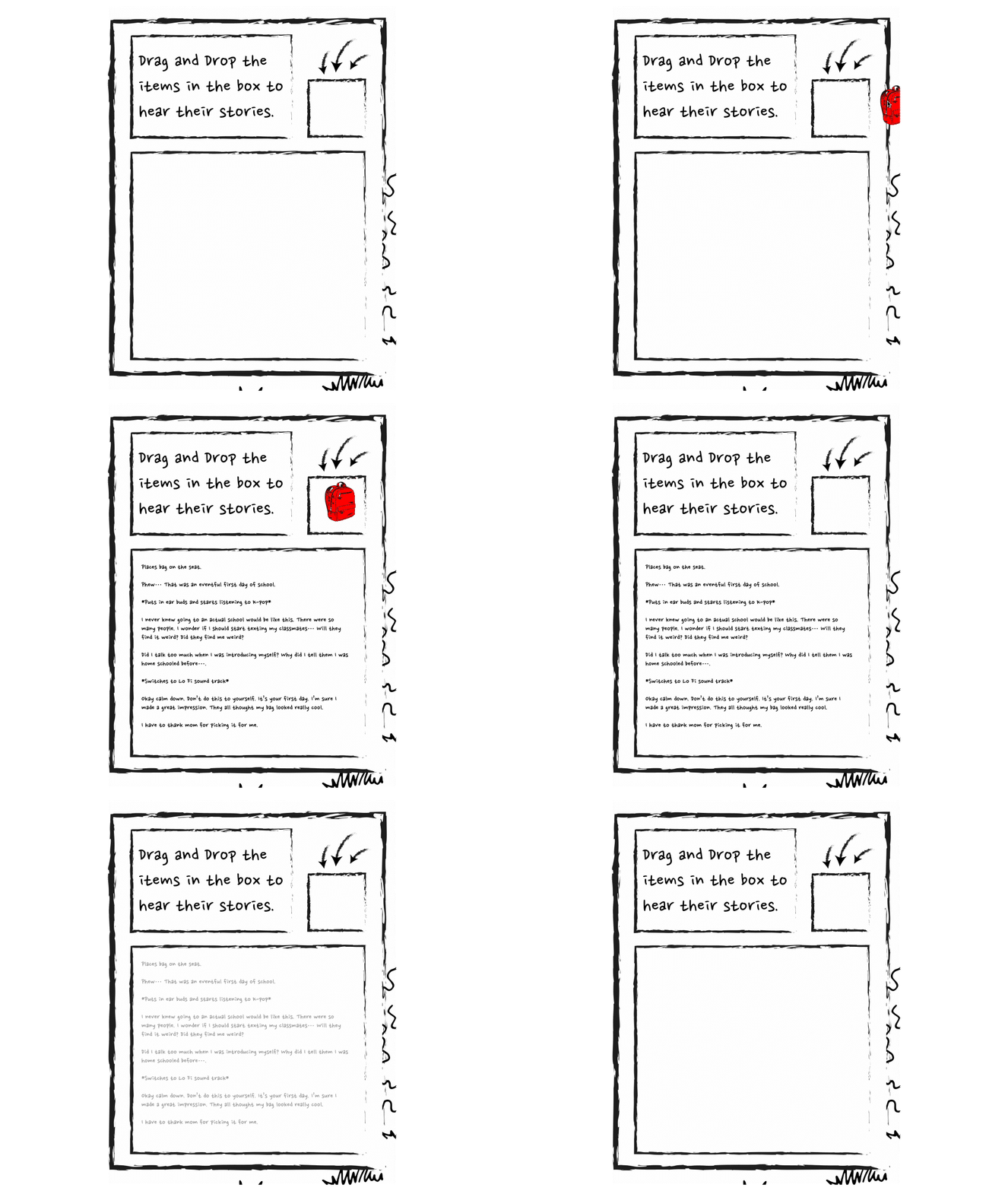
The third plugin reveals the story related to the object once that object has been placed in the specific area. For this I created a side bar that drops down with information and directions. I kept the instructions simple and easy with arrows to direct the user to the area. Although I used words and arrows for this plugin, placing them in a separate container it still feels organic to the page because I made it have the same sketch drawn style as everything else. The text that appears is also written in a font that matches the aesthetic of the page.
UI Elements
Without proper considerations of these UI elements, the plugins would not have been noticeable and the website would not have felt user-friendly. Their consistent style that matched the artwork on the website and made everything feel cohesive. If other buttons or other indicators like using arrows to pointed at the objects were used, they would have done the job but they would not fit in with the overall look and feel.
Final Thoughts
The main challenge I faced was making this interface mobile responsive.
I struggled trying with portrait view as the images I used were all
fixed for landscape and did not intuitively rearrange for portrait view.
The entire interface would need to be rearranged for it to be
user-friendly on portrait view.
However, when a user does try to use this website with a viewport of a
smartphone, a prompt requesting the user to turn on landscape view on
their device could fix this issue. So it will require the user to switch
from portrait to landscape for this webpage to be mobile friendly.As a
UI designer, I learned a lot from a coding perspective from this project
and how some ideas are not a feasible as I would have initially assumed.
I feel I have gained a better insignt to working with coders and their
struggles.