Echoverse: A music streaming app
An app to bring a funky and fun music streaming experience.
Goal: Create a visually attractive music app.
The purpose of this project was to create an app design about any topic using Illustrator. We were required to make everything from the logo designs, wireframes, and the app mockup of how it would look in its final design. I worked in a team of 3, and we decided to make a music streaming app for the project. The reason was that it was the type of app we were very familiar with and understood how the UI would work.
Moodboard
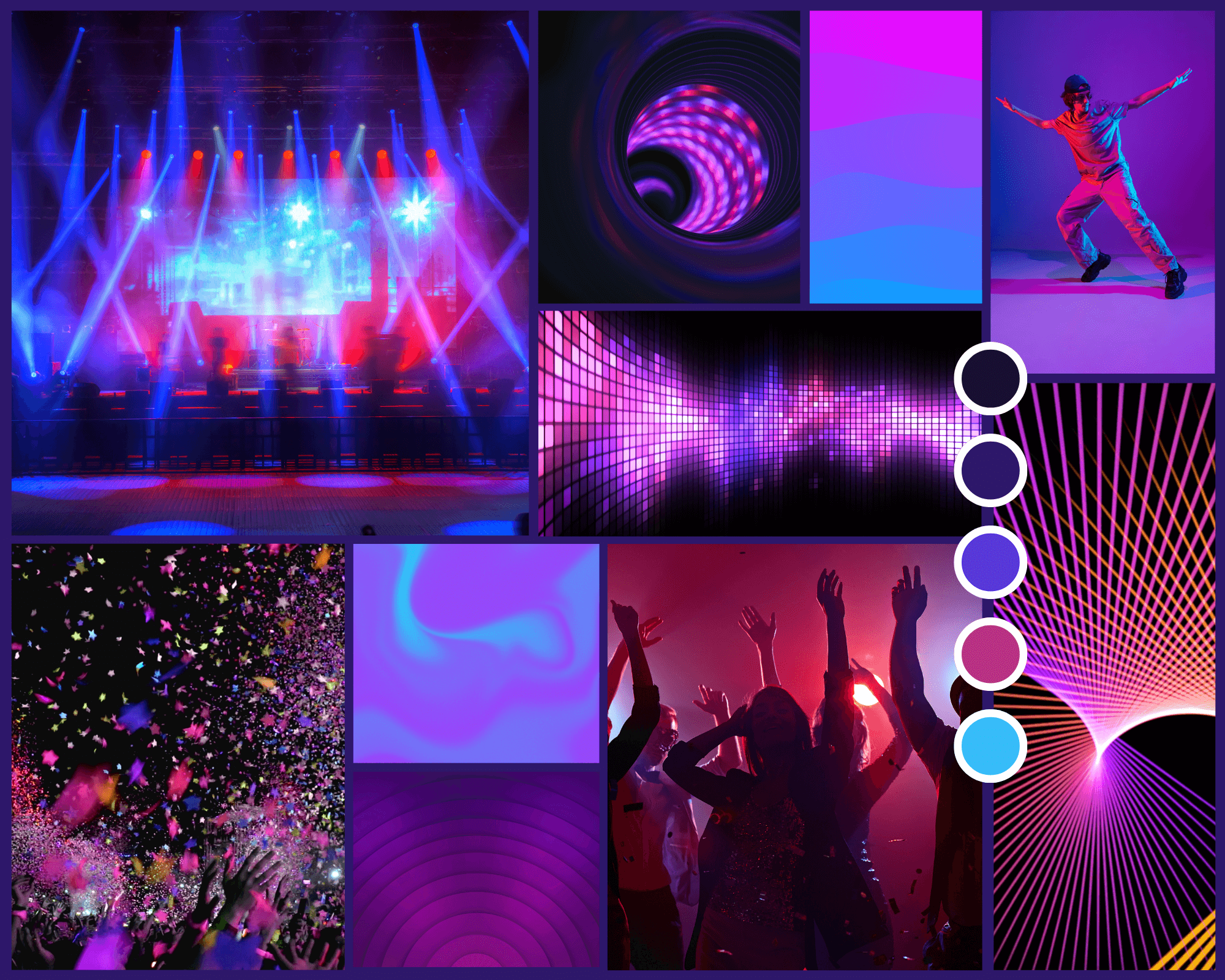
Our first goal was to make our app look funky and fun. Most of the apps I saw were very modern but felt boring visually. So, we started with a mood board to help us find the colors and emotions we wanted our app to invoke.
We discussed various names to call our app and themes on how it would look like. We decided on Echoverse as the name and a psychedelic color scheme combining blue, purple, pink, and teal. We chose Echoverse because it makes our app sound vast, like a universe, and the word “Echo” is meant to be associated with sound. Therefore, it suggests that the app would have an expansive selection of music. The color scheme choice was to make our app feel unique compared to our competition, and the colors enabled us to make the app feel more visually appealing.
Logo Designs
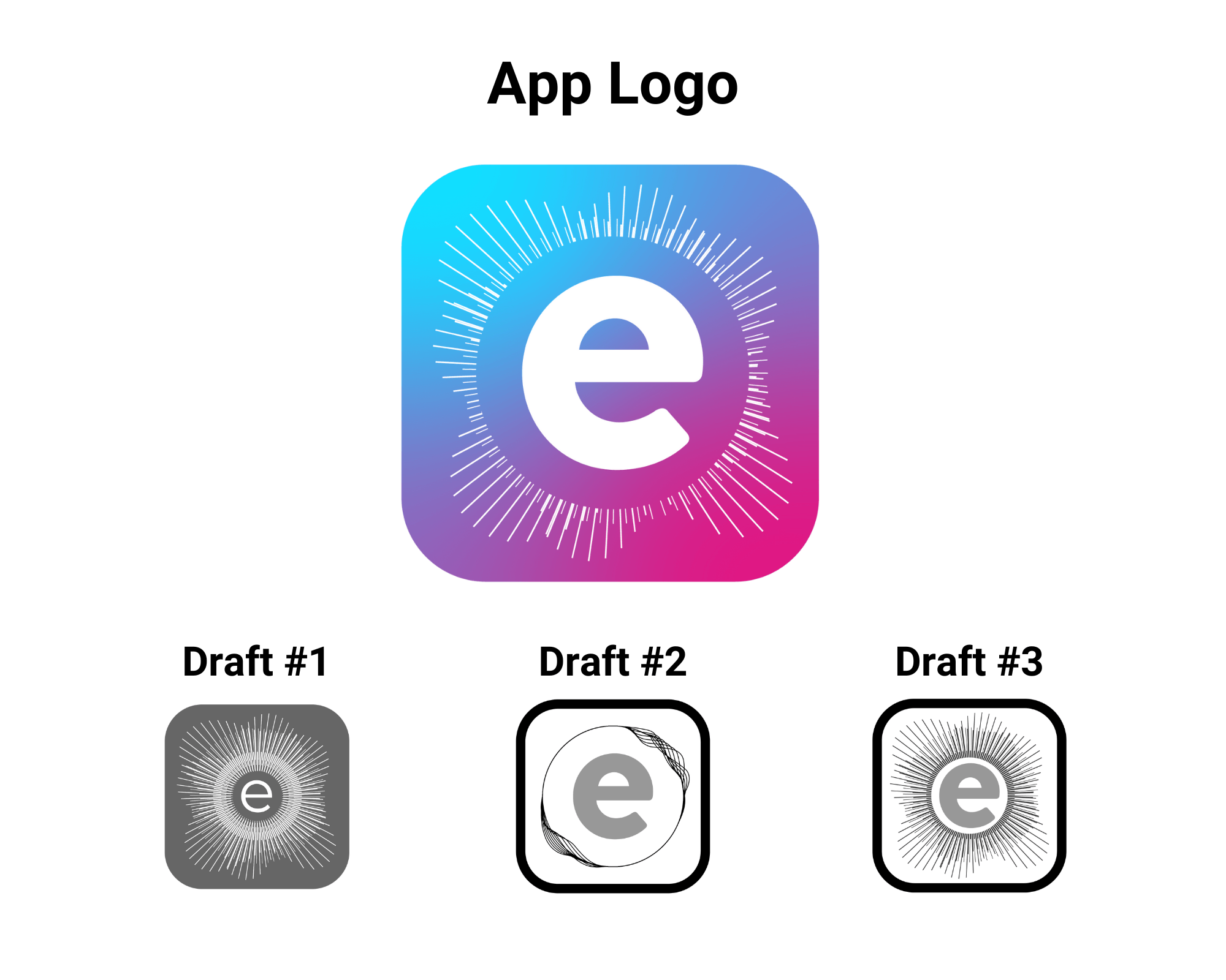
From there, we wanted to make an exciting logo and used sound wave/frequency depictions to mimic visualizers from music players from the early 2000s. Growing up then, I remembered how fun and relaxed they looked. It felt like the music players today lacked something visual that the previous music players had. We did understand that most people would generally lock and put their phones away after starting a song, but that doesn’t mean this feature would be useless. This feature would help us set our app apart from what was missing from the other apps.
Wireframes & UI Icons
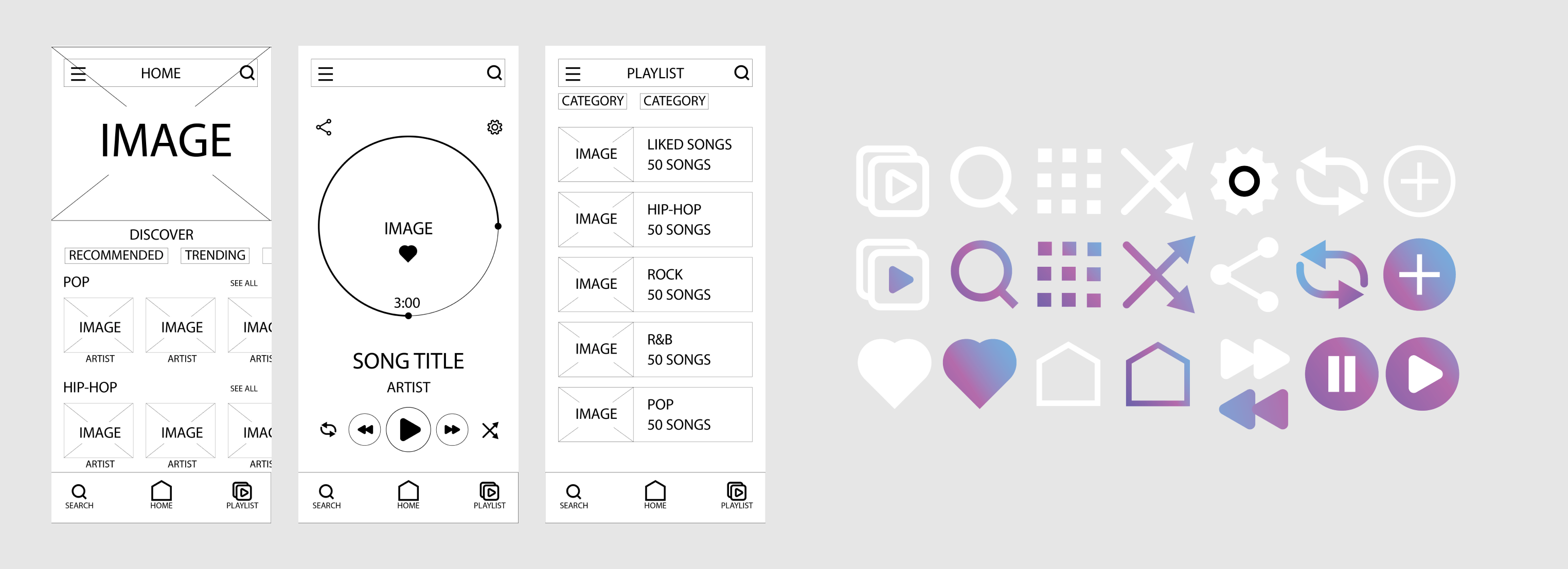
We decided to focus on the main components first for the wireframes and divided the work between one of my teammates and me. I created the initial layout design and we used it as the reference to keep our designs consistent. We decided we didn’t want to make the layout design too different from other apps because we were worried about the users feeling like the environment was too unfamiliar. We kept things like where the play button would be placed or where to find the settings. I also helped create the icons for our app's user interface.
Prototype
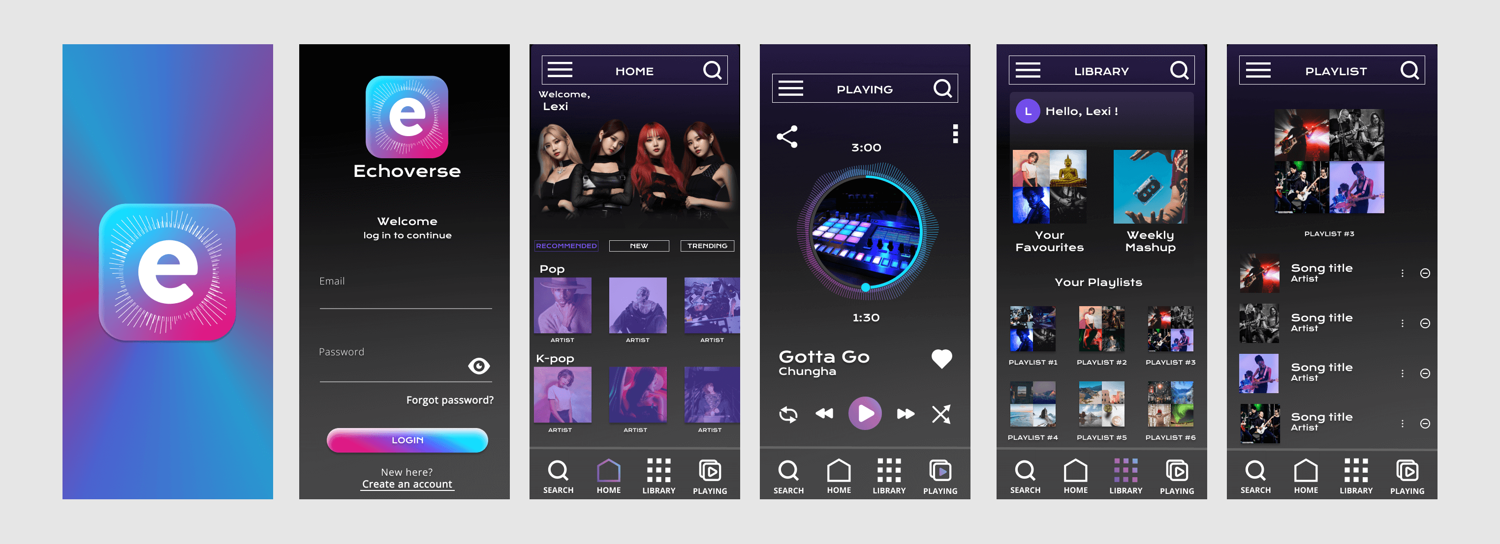
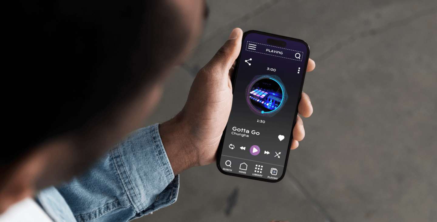
As a group, we also decided we wanted to have a circular visualizer around the play timeline of the song, which was also circular. Just like the visualizers from the early 2000s, the idea was it would move depending on the music. I had a lot of fun experimenting with how to do this. Adding this visualizer helped us to push our brand identity. Our other teammate took the UI elements and put them on Figma to create the app mockup altogether.
Final Thoughts
All three of us enjoy listening to music a lot so this project was indeed a lot of fun for us. It was a great opportunity for each of us to explore the different music apps and their layout designs. To use our UI knowledge and decide what types of UI icons, layouts and principles we wanted to keep in our app. The biggest challenge we can see with this project in the future would be to use code to make the visualizer work as it is our most unique feature.