BusyBod: A FITNESS APP THAT FITS YOUR LIFESTYLE
A fitness app for people with busy schedules that fits their goals
Goal: Achieve a usability score of 90% or more.
The purpose of this project was to showcase my skills as a UI designer in how I demonstrate my ability to display various types of information and data. I chose to make a fitness app because they require highly effective layouts, text hierarchy, and data visualization. I wanted to create an app that caters to everyday people, especially those with busy schedules like full-time workers, students, or parents.


Persona
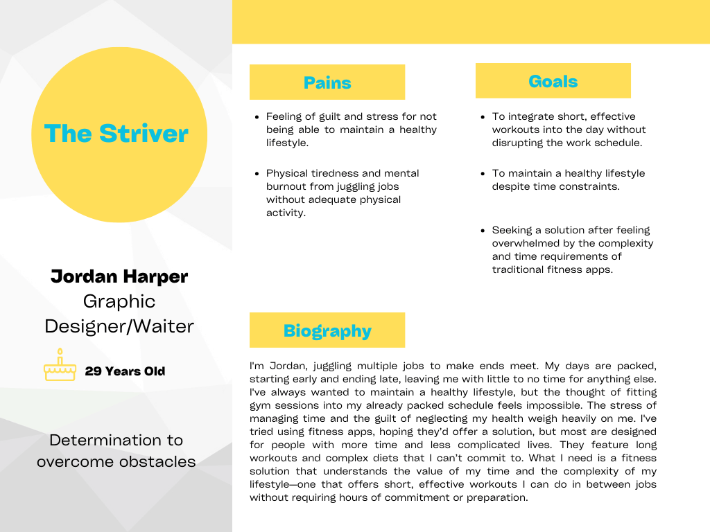
When researching a fitness app idea, I noticed that most apps didn't cater to people with super busy schedules, like those working multiple jobs. This gap led me to create Jordan's persona. My aim was to design an app that understands and solves the real-world problems of users struggling to find time for exercise, offering a practical solution that fits their hectic lives.
Wireframes

In designing the wireframes, I focused on creating a clear hierarchy and simple steps to ensure ease of use, especially for people like Jordan, who have limited time. I integrated images and dynamic layouts to make the app visually appealing and intuitive, ensuring that users can quickly understand what to do without feeling overwhelmed.
This approach is crucial for those with hectic schedules, allowing them to seamlessly integrate fitness into their daily routine. By prioritizing straightforward navigation and engaging content, I aimed to craft an app experience that respects the user's time and energy, making it easier for them to commit to staying healthy amidst their busy lives.
Mockups

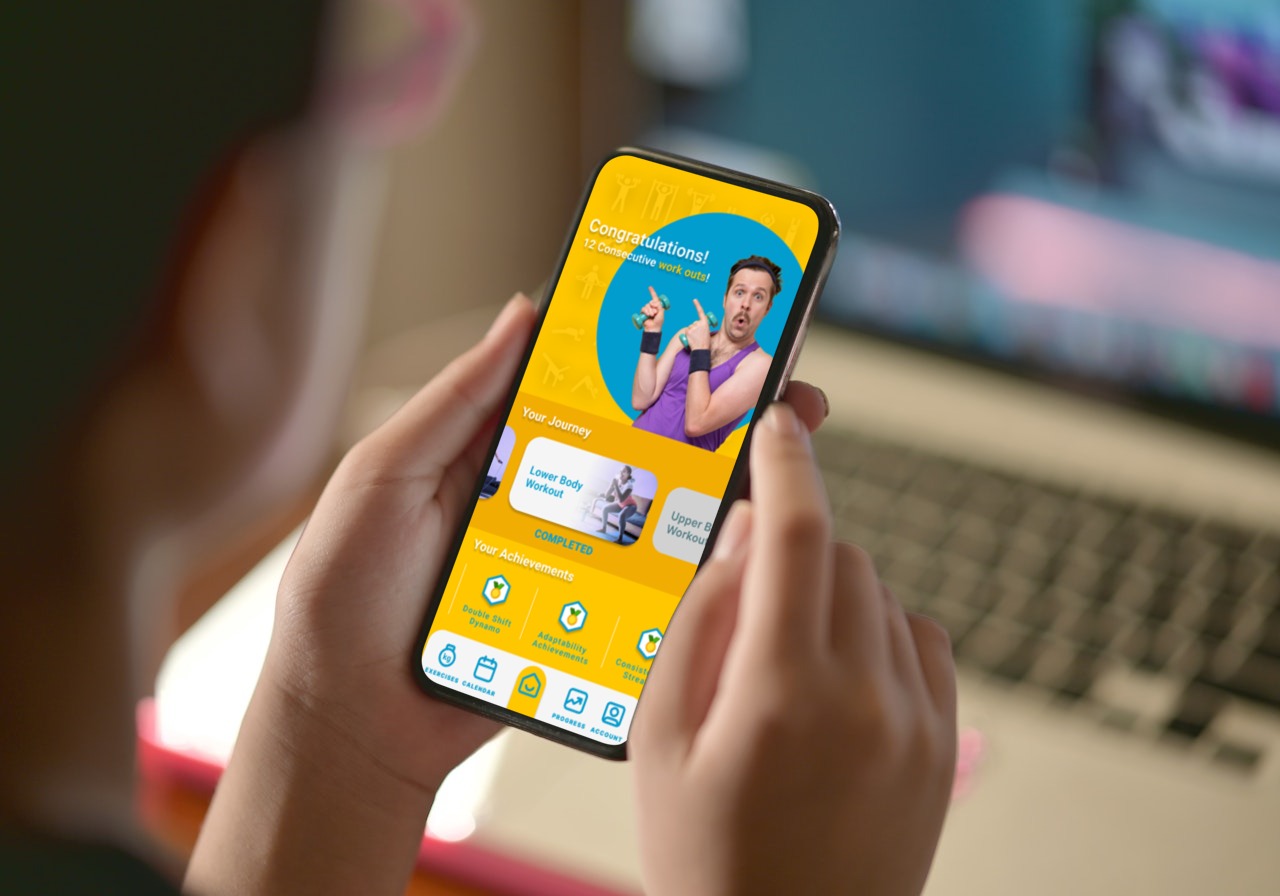
In creating the mockups, I chose bright and vibrant colors, specifically teal and yellow, and opted for fun images instead of the typical photos of very fit models. This choice was deliberate to make the app feel different and more welcoming to the target audience, like Jordan. The use of lively colors and relatable imagery aims to lower the barrier to entry, making users feel at ease and motivated right from the start.
To streamline the user experience, I added a swipe feature on the progress page, allowing users to focus on one section at a time. This design decision helps reduce clutter and overwhelm, making it easier for users to track their progress without getting lost in a sea of data and information, catering to their need for simplicity and efficiency.
Final Thoughts
The biggest challenge in designing this app was creating a user-friendly progress page that could display data and include information like the user's achievements without overwhelming them. To tackle this, as previously mentioned, I divided the page into swipeable sections, allowing for a cleaner presentation of information. Moving forward, I plan to conduct user testing to refine the app based on real feedback. Additionally, given a higher budget, I would prefer to produce exercise videos in-house to ensure they align perfectly with our brand's aesthetic and values.